If your colour choices are just incidental, you’re probably using your colours wrongly.
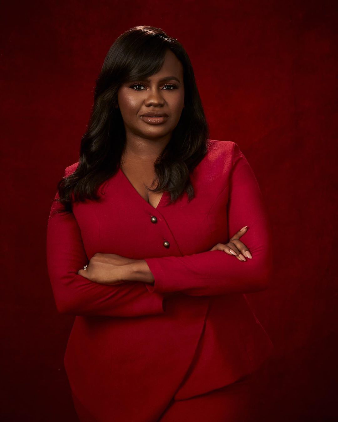
Award winning director and producer, Jade Osiberu, is one of the most exciting storytellers in the Nigerian film industry. Emerging from Ndani TV and subsequently debuting strongly on the cinema scene with Isoken, a lushly executed drama that was well received by audiences and critics alike, Osiberu has shown a commitment to an aesthetic arrangement based on bold colour choices.
Spanish painter Pablo Picasso once said that colours, like features, follow the changes of emotions. This appears to be the underlying philosophy behind Jade’s artistic intentions. Credited as production designer on her projects, she retains a direct control on the colours that appear on screen, a quality often associated with auteurs.
Her work so far has been largely restricted to drama and romance, deeply rooted in Lagos pop-culture.
With Gidi up, she burst onto the scene, telling the story of four young adults pursuing success in Lagos. The melodrama that takes place onscreen is mirrored in the hot colours of the costumes and set. With a colour palette of mostly deep reds, browns and orange, showing the flaming passions of the characters, the realism of Lagos is elevated beyond dialogue and the colours give off a mood that is sexy and yet dangerous.
In Isoken, a woman is at the heart of this heart-warming drama. Whether it is in dinner scenes with the family, pure banter with friends or dates with men, events play out on colourful sofas or office chairs, often embroidered with more colourful fittings, in rooms bedecked with stylistic African art hangings, all working together to make the characters stand out in a scene. What this does is creating, very easily, moments that are easy on the eye and excessively classy, paying homage to rich Lagos. Her major colours here are yellow and orange, suffused on the rich browns that serve as an allegory for African skin. Taking a stab at possible emotive underpinnings, it is widely considered that yellow suggests be cheerfulness and mood-lifting while orange calls to mind feelings of excitement, enthusiasm, and warmth.
On Sugar Rush, directed by Kayode Kassum, an intentional colour palette is obvious even as she takes up production duties behind the camera. Sugar Rush, like the title suggests, is an explosion of sugary colours, featuring splashes of purple, red, yellow and blue, reflecting the mood of hedonism and criminal fun perpetuated by bold characters.
These interesting colour choices extend into marketing, especially with the posters, and they surely have played roles in the critical and commercial successes associated with her projects. In an interview with Niyi Akinmolayan, the intentionality guiding her choices is further unpacked: “On Gidi Up, we never had an art director or costume; I’ve always done art direction with the help of everyone else on the project. I’m really interested in production design and how it helps to develop characters and themes in the audience’s mind.”
When creating a world, a filmmaker must think about everything, including colour. Intentional colour design elevates the action and words on the screen.
By Taiwo Egunjobi


Leave a Reply